Innovation at LegalZoom
LegalZoom’s LLC formation product accounts for almost half of the company’s revenue. As such, leadership is hesitant to take big risks on changing the product offering or experience.
I was hand-picked to lead product strategy and design for a small cross-functional team created as a “startup” within the broader company. The goal of the team was to create a friendly and welcoming experience independent of legacy systems and to experiment with price point, look and feel, and product offerings. All to be delivered at the end of four weeks.
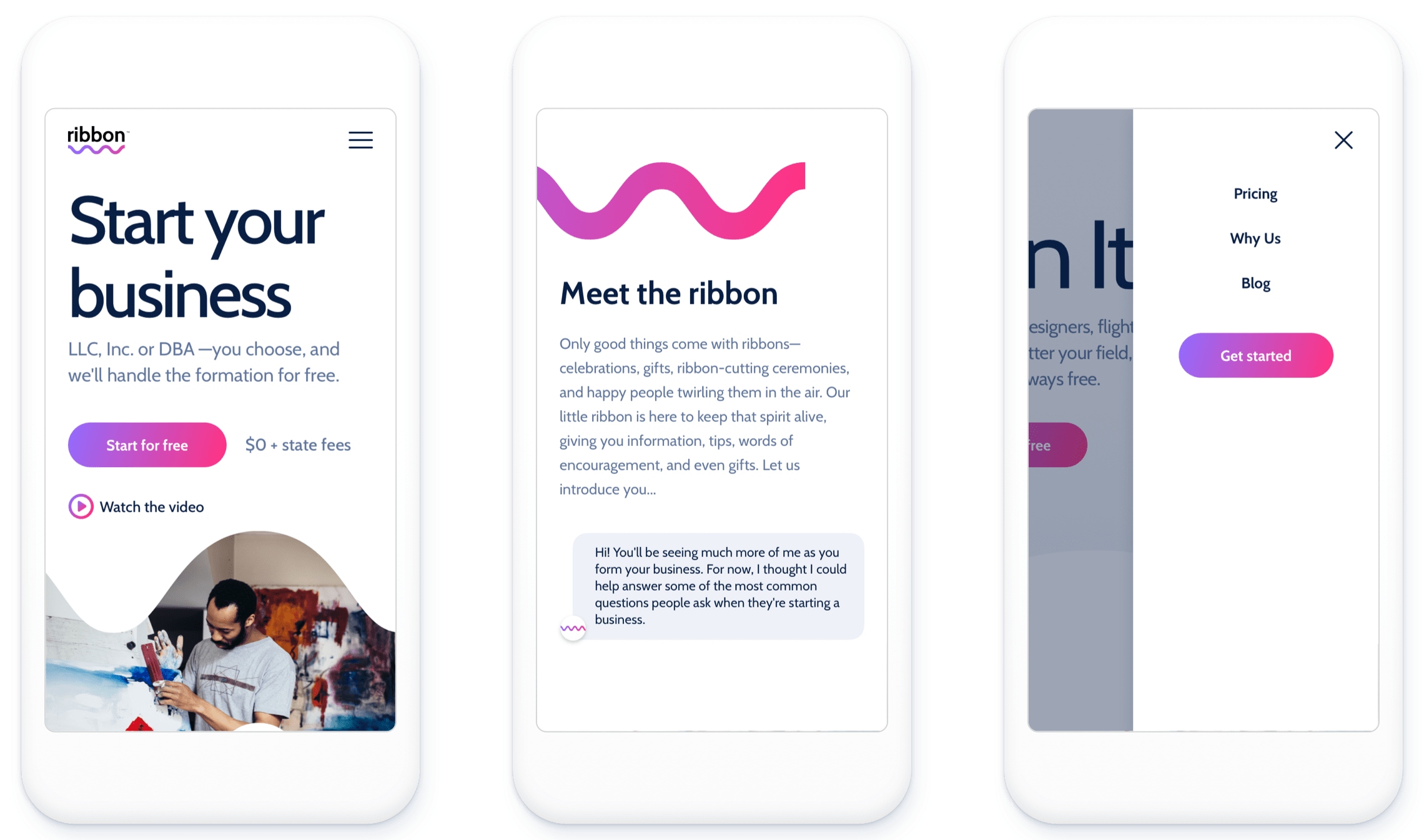
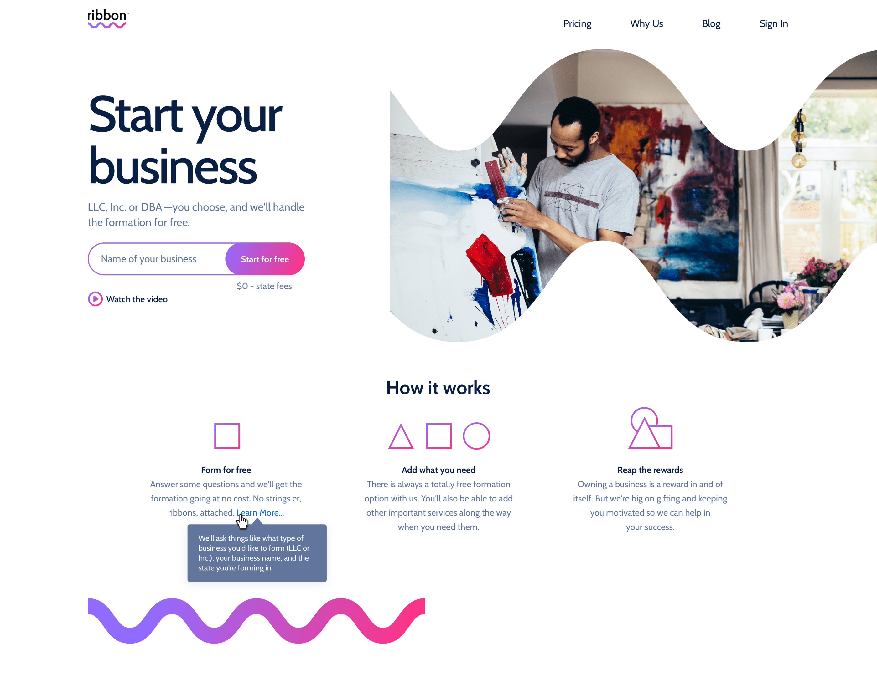
The final site is live at ribbon.io
My role
- Product strategy: As Principal Designer, I partnered closely with the VPs of Marketing, Creative, and UX to determine product strategy.
- UX & Product design: Mind-melding with a fellow Product Designer, we pair-designed the entire experience from top to bottom, developing a design system and a visual language.
- Engineering: I worked closely with our engineers to ensure velocity as well as 1:1 parity with shipped designs. This included functionality, look and feel, and animation.
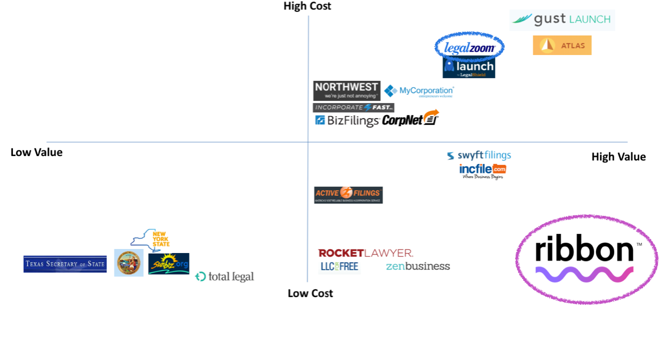
Determining target market
To differentiate the Ribbon experience from LegalZoom’s typical customer, we decided to target downmarket customers with a free business formation experience. To visualize this, I put together a competitive landscape diagram.
Strategy
In order to complete this project at the required velocity, I had to make informed assumptions based on existing research and design. This included competitive analyses, proto-personas, customer journey maps, and mothballed designs for similar projects that had been usability and demand tested.
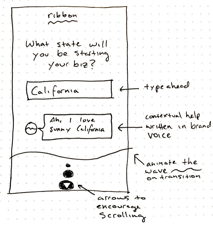
First, I determine the information architecture
After several rounds of back and forth with key stakeholders, I was able to narrow down the focus of the site to a set of key pages, which I then mapped out for easy digestion by the team.
[IA screen here]
Next, establishing baseline layout and functionality
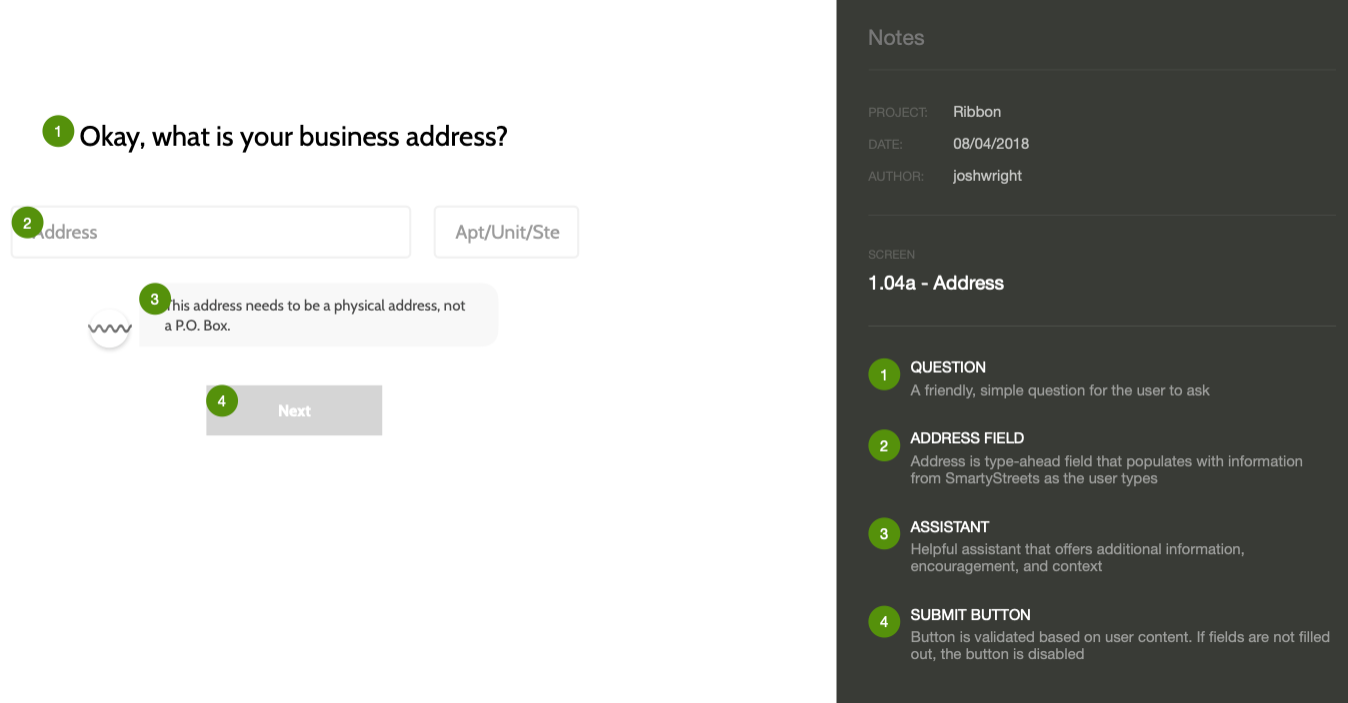
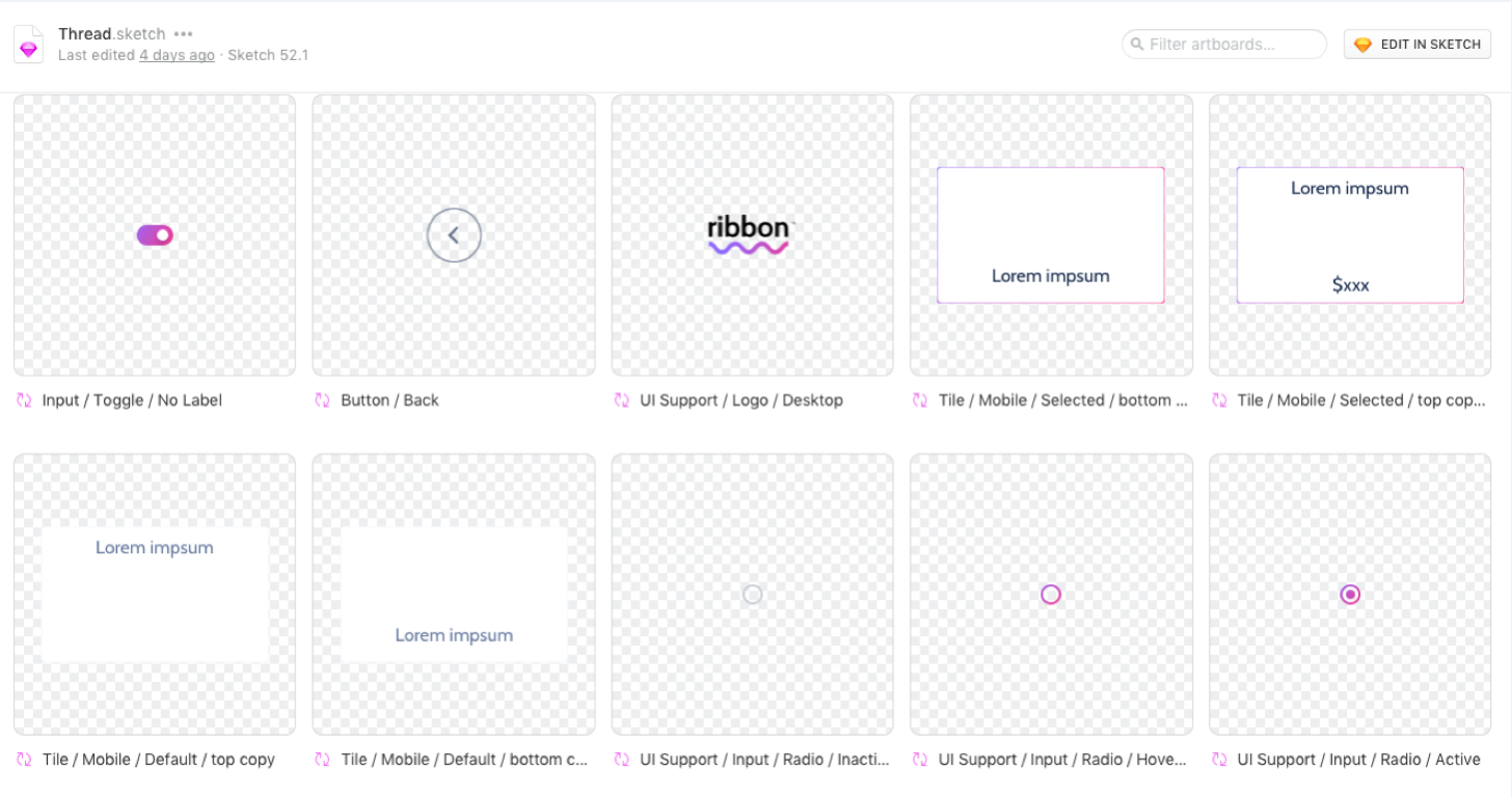
Thread, our design system, is born
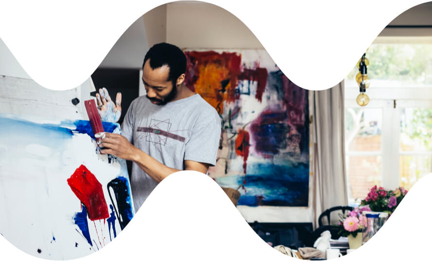
The brand begins to emerge

We start building
I partner closely with our engineer to ensure design parity.
We work in one week sprints, and use Zeplin, Slack, and video chat to communicate when we’re not on-site.
The final site is live at ribbon.io
Outcomes
To avoid overwhelming our third party vendor, in our first few weeks we decided to cap orders at 100. We also set our expectations very low on conversion rate due to the brand being unestablished.
To our surprise, our conversion rate for week one was 3.6%, which exceeded our expectations.
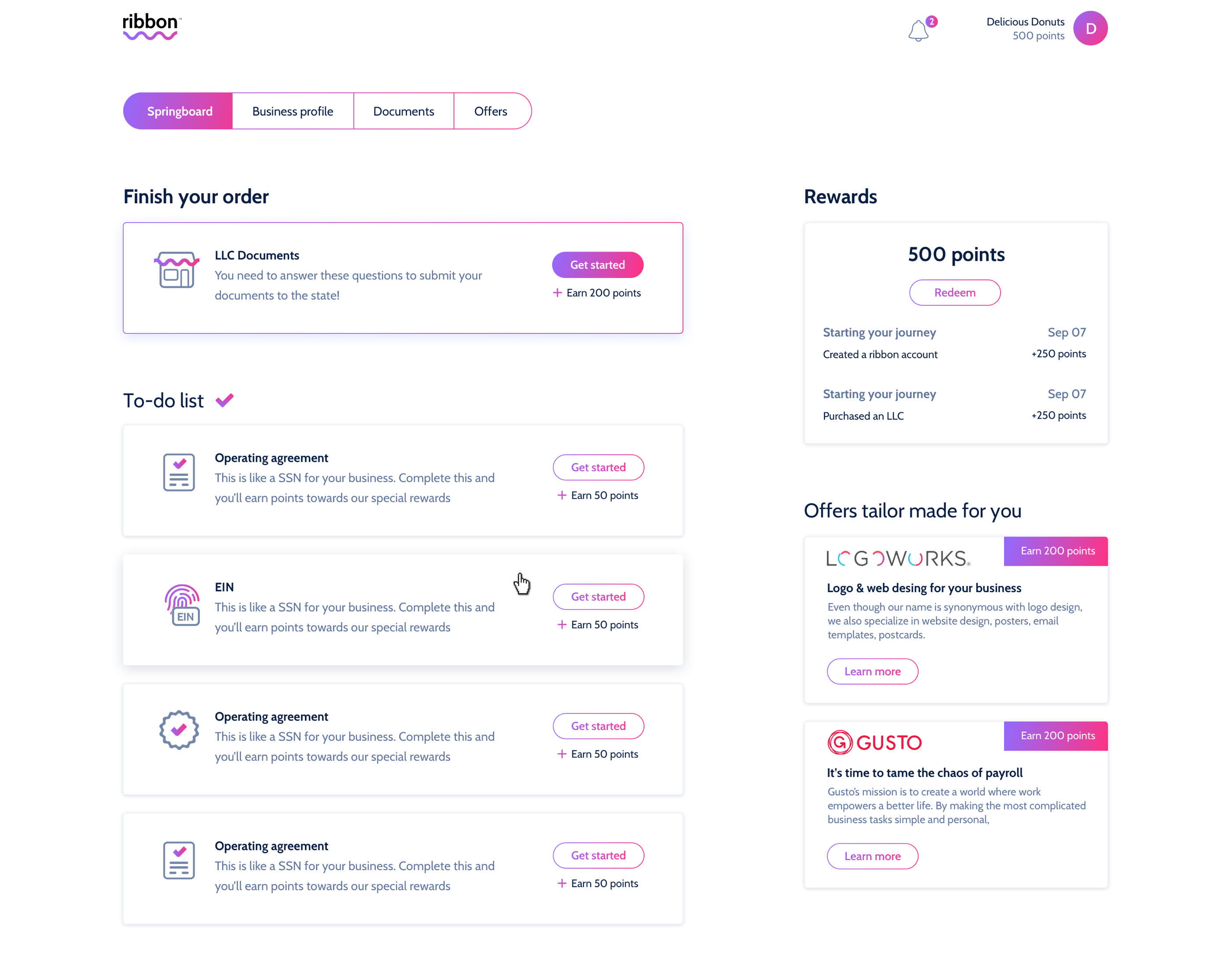
Further explorations
Towards the end of the project, I was tasked with exploring the post-conversion experience. This would allow customers to track their orders, explore partner offers, and update their business information. Additionally, I was exploring possible gamification to encourage long-term customer engagement.