A process in trouble
Benefit enrollment can be stressful. Users have a limited window each year to make changes to their health care benefits, and they’re worried about getting through the process. With over 70% of the 60,000 employees at the Fortune 500 company using the application, the technical skill of users was unpredictable. The process needed to be as usable as possible.
It wasn’t, and there was a crisis. In the years leading up to the redesign, the company had to hire a team of temporary workers each year to deal with the volume of support calls. In fact, call volume was so high that the corporate phone system would crash from the overload. The company needed a change, fast.
My role
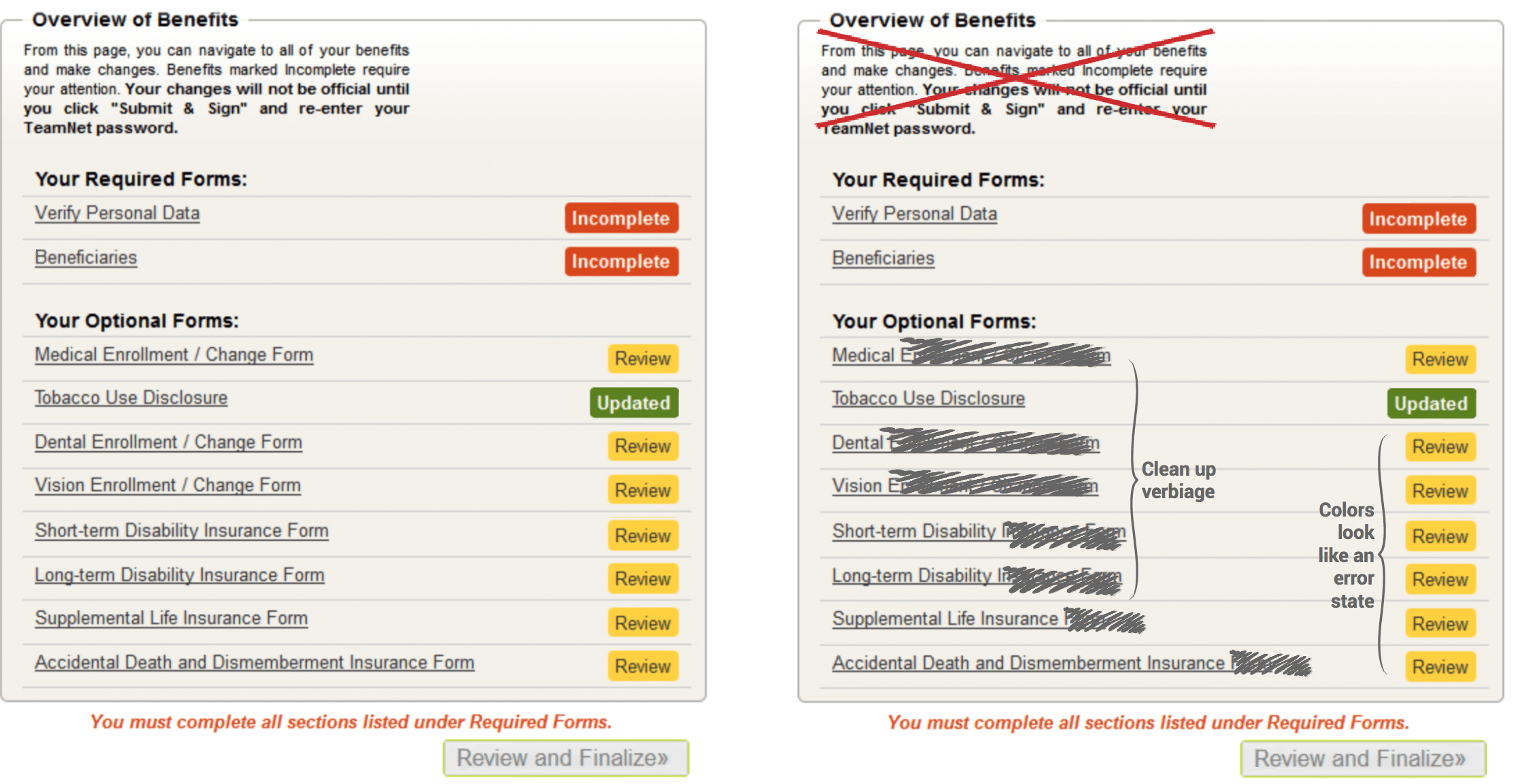
Two months before the project had to go live, a coworker and I pitched a rapid-fire redesign to the Director of Web Applications. She accepted, and we went to work. I started by doing a few quick guerilla usability studies to see how the average user interacted with the existing application. This highlighted a few pain points, the biggest of which was the landing page:
My process
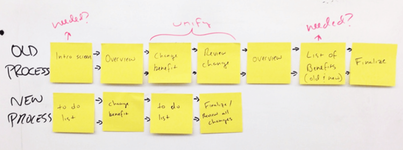
Two key issues came to light through my research: the flow of the application was confusing to users, and the design lacked a clear visual indication of what to do next. I pulled out my post-it notes and put together a simple task flow to brainstorm options for streamlining the user flow.
Sketch, wireframe, prototype
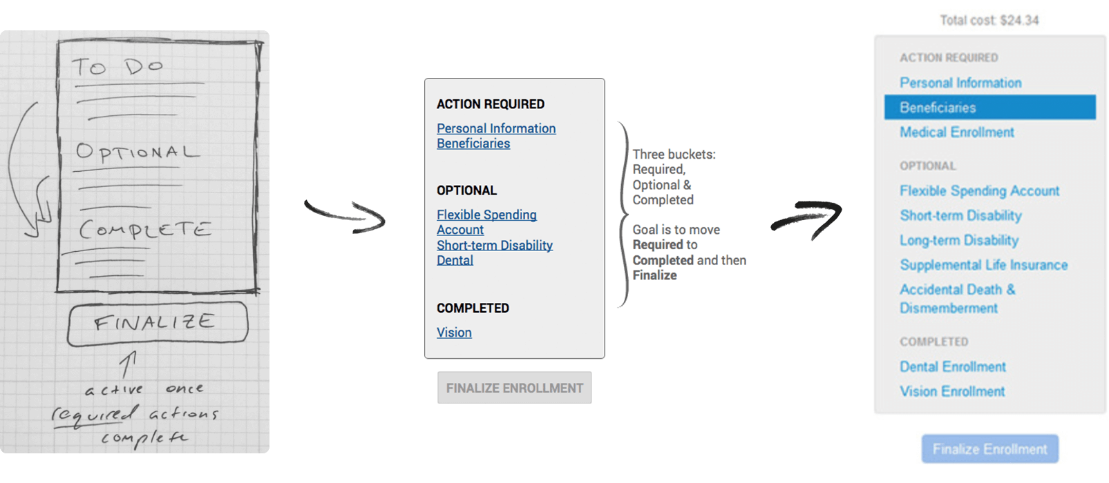
Consolidating a few of the tasks into a single step simplified the design, and changing the terminology from “Overview” to “Action Required” clarified the actions the user needed to take. I began by sketching a few ideas incorporating the new concepts, which I later translated into a quick mockup for stakeholder review.
Testing my theory
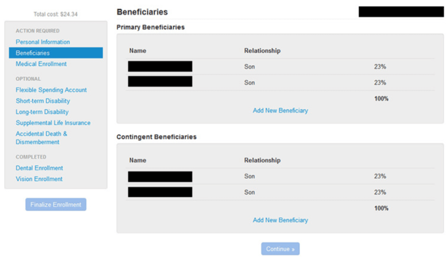
During the implementation process, I conducted usability tests to determine if my ideas were sound and quickly iterated based on the feedback. I worked closely with developers during this phase to make sure my prototyped ideas were successfully implemented. Within one month of the design being finalized, the redesigned application went live.
The outcome
The week the redesign rolled out, I visited the Benefits department to check on the status of the launch. To their shock and delight, what was normally the most chaotic week of their year was no busier than usual. The redesign resulted in a 95% reduction in support calls, and a direct savings of thousands of dollars due to the team of temporary workers no longer being needed.