Learn, share, connect
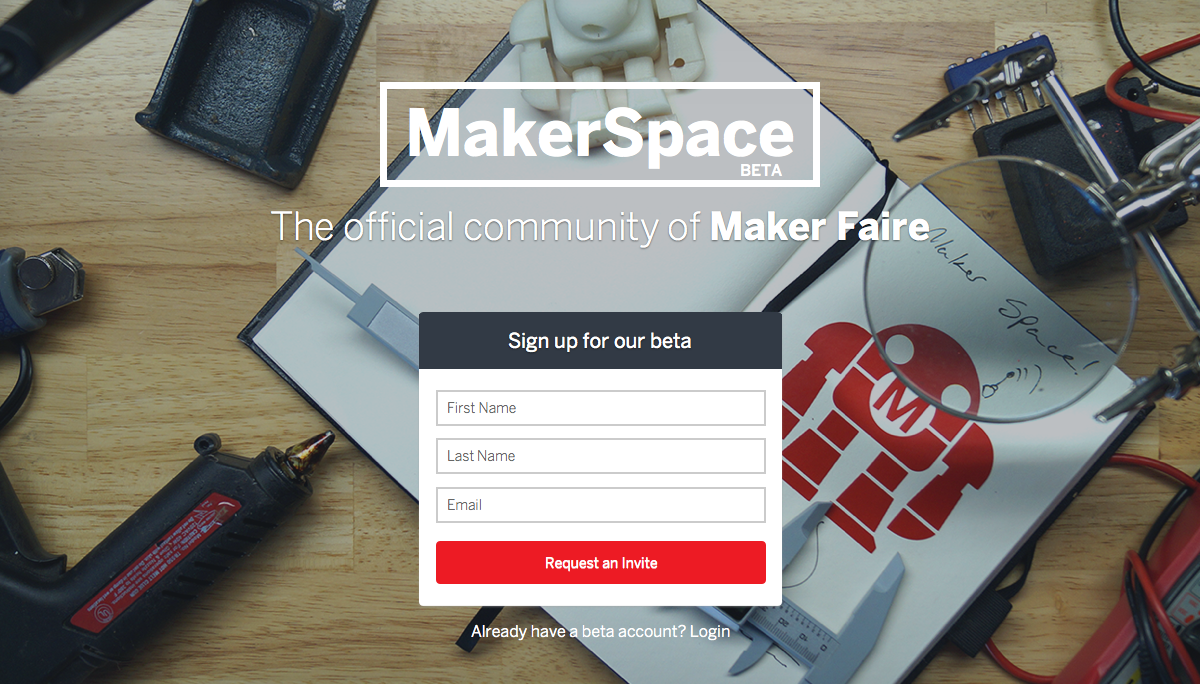
MakerSpace was a social network created by Maker Media, the company behind Make: Magazine and Maker Faire, to bring the Maker Movement online. The core team was primarily remote, and acted with autonomy as a small startup within the larger corporation.
My role
I was lead Product, UX and Visual Designer throughout the life cycle of the product, collaborating with a variety of stakeholders on everything from the art direction of promotional materials to interfacing directly with the CEO in a weekly strategy meeting.
Using Lean methodology, I worked hand-in-hand with the developers, producing high-level strategy and artifacts that included wireframes, high-fidelity comps and interactive prototypes. We often collaborated via “pair design” sessions over video chat, iterating in real-time on the implementation of my designs. In the final stages of the product, I worked with our Product Manager on overall strategy, leading to our final and most successful pivot: Spaces.
Press
Engadget / TechCrunch / Makezine / Fast Company
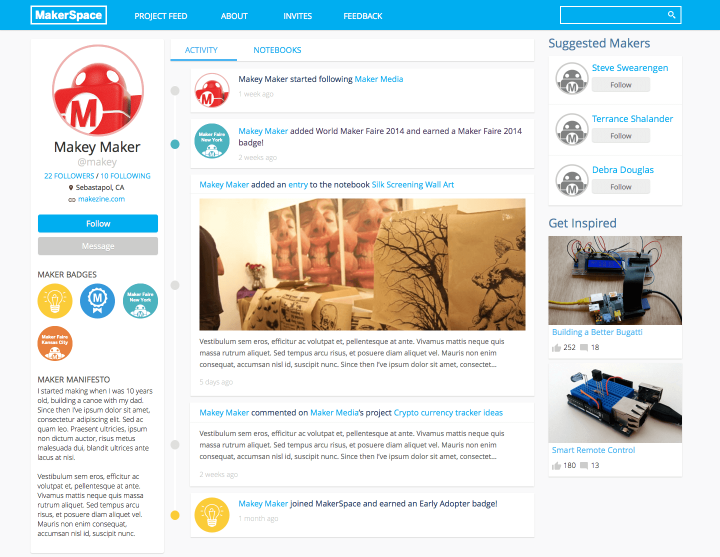
Minimum viable product
When we started the project, the team was given an ambitious goal: launch an MVP at World Maker Faire New York just 45 days later. The team rose to the challenge, iterating rapidly and building out the social platform from scratch. We onboarded our first 700 users on-site at the Faire. What follows are a few design artifacts from that first crazy month.
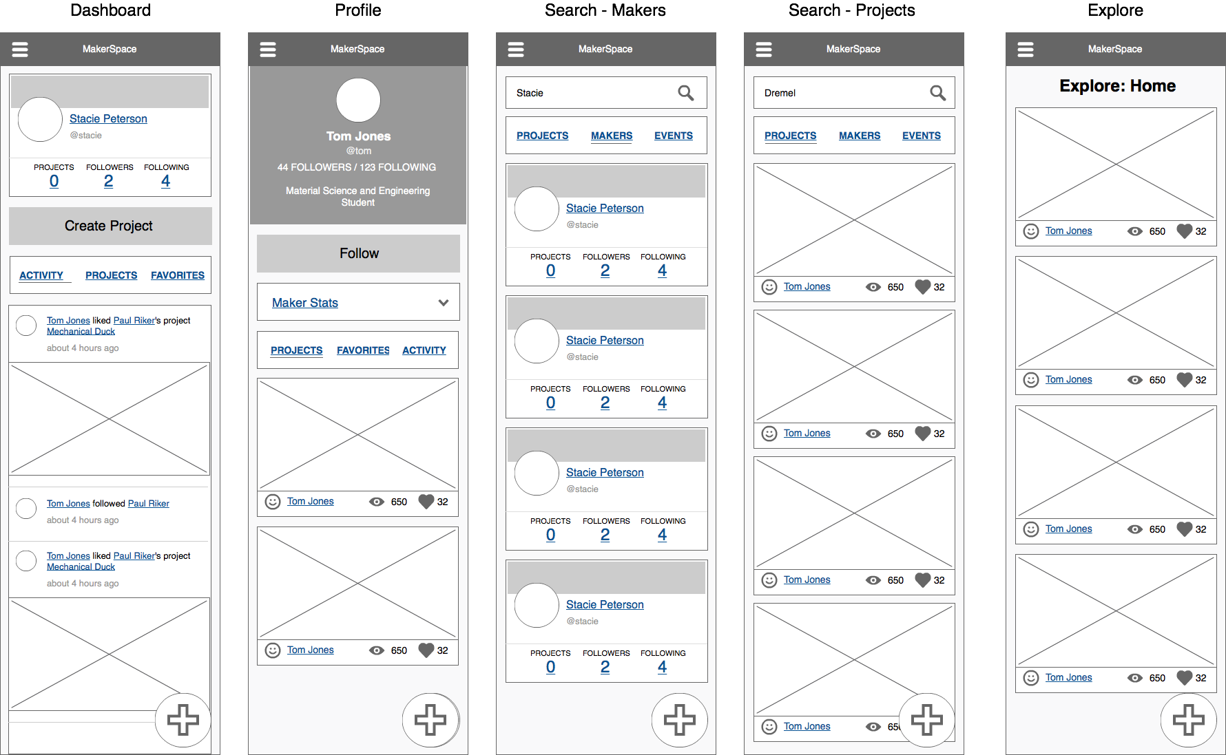
A focus on mobile
As a part of the initial designs, we considered the mobile user experience of the product to be very important. To guide the responsive implementation, I provided low-fidelity wireframes and worked in the HTML architecture to lay the groundwork for the eventual implementation.
Evolving our design
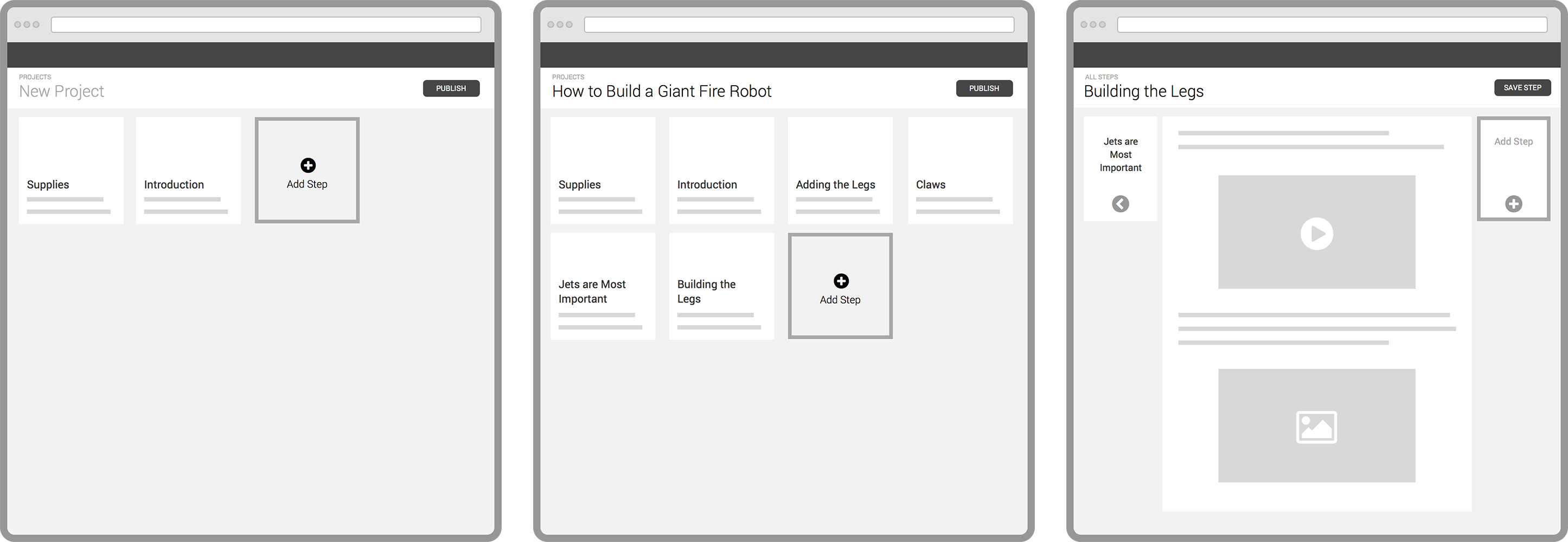
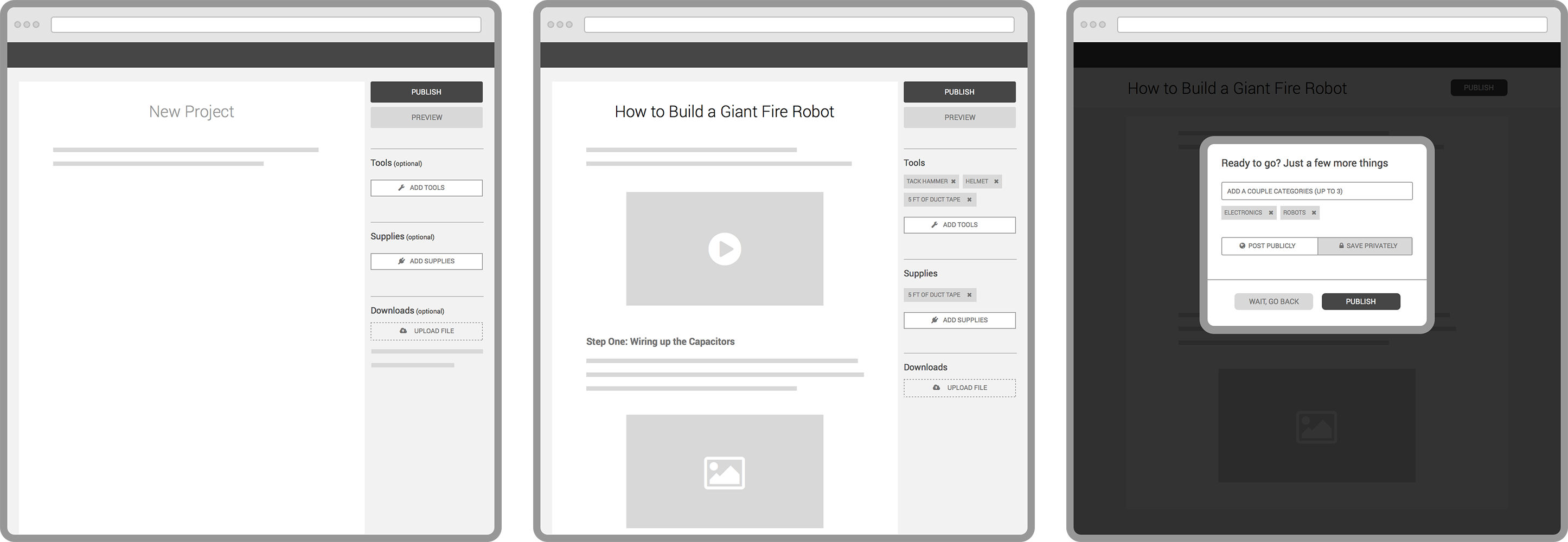
During the course of the project, we explored multiple design directions that would allow users to share and build their projects.
VERSION A - Steps as blocks
VERSION B - Steps in a flowing, Medium-esque format
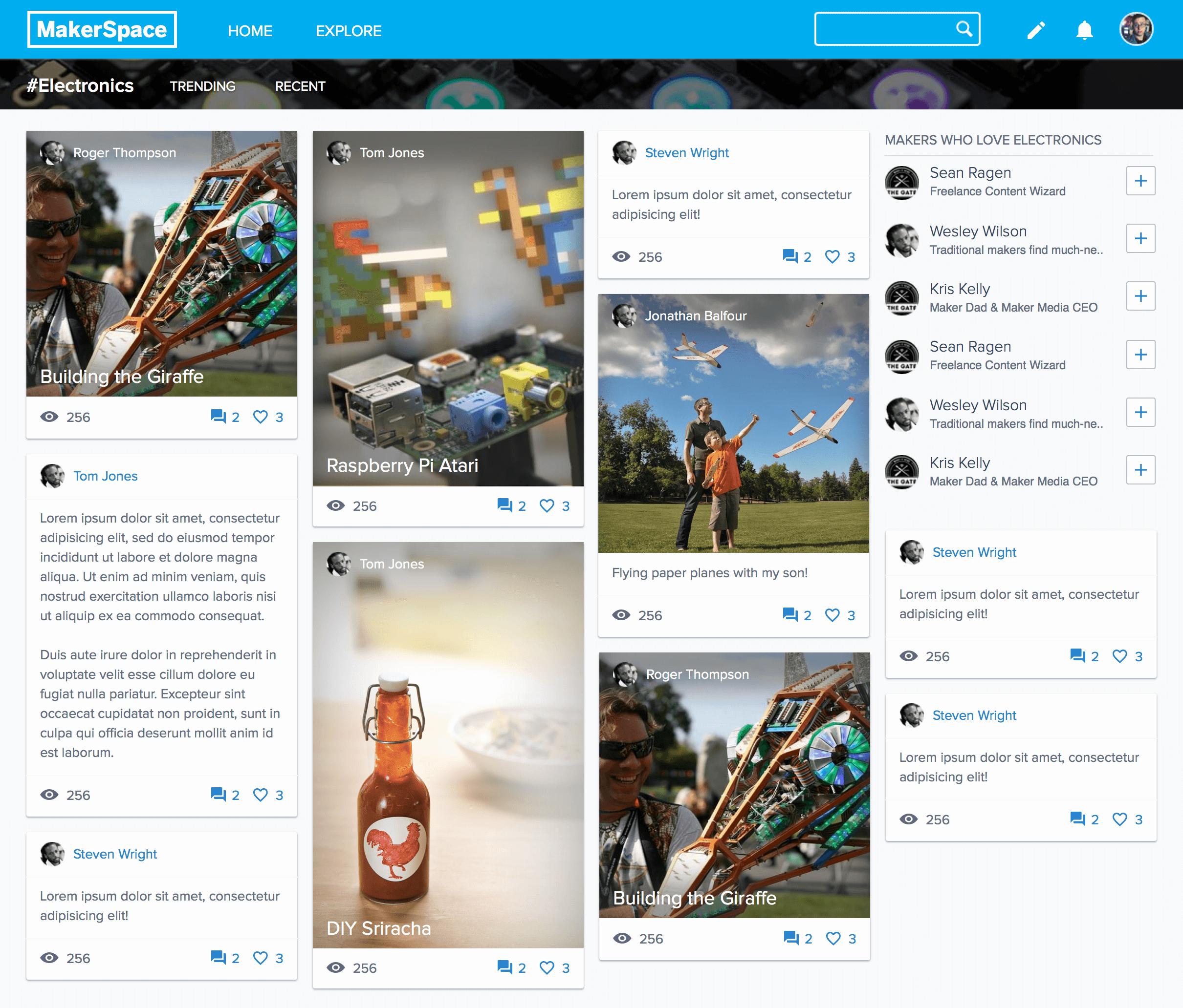
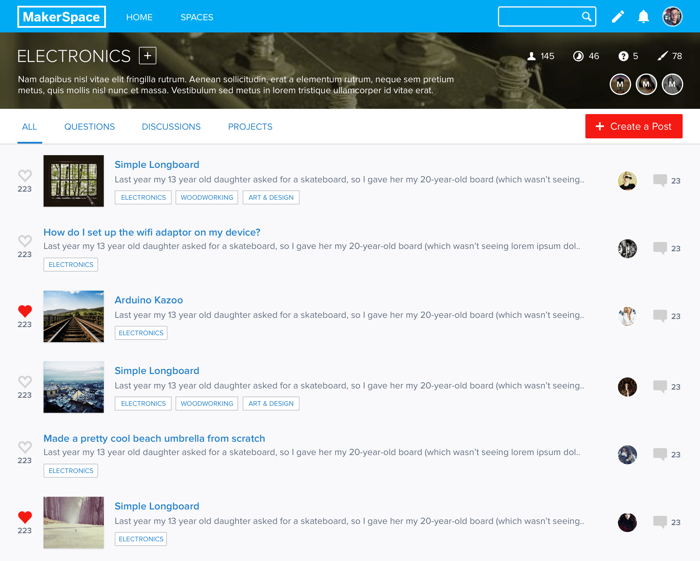
Community-driven spaces
The Spaces concept allowed for predefined areas for user content, with the eventual “killer feature” being user-defined spaces. We initially rolled out this concept with a set of 12 predefined spaces based on community feedback, and user content creation exploded. Usability testing showed that users felt like they were connecting with others rather than simply broadcasting. I explored several directions for this feature, with the feed layout ultimately being the most successful.